User onboarding, an evolution
During the last year or so, I spent some time working with the Creator Activation team to address some of the problems around new user onboarding. In Teachable's history, new user onboarding wasn't a central priority; it fell under the jurisdiction of the Growth team. The pandemic years saw a surge in new sign-ups as businesses transitioned their in-person classes online. However, in recent years, there has been a decline in new users creating products. Hence, there's now a renewed emphasis on guiding new users towards success on Teachable.
My role
As the principal product designer, I collaborated with the creator activation pod to shape the vision and direction of new user onboarding. Based on research and best practices, I designed the onboarding experiences, led and supported the team during implementation.
Team
1 Product designer
1 Product manager
1 Engineering manager
5 Engineers
Skills
User research
Product strategy
Interaction and visual design
Prioritization
The opportunity
Background
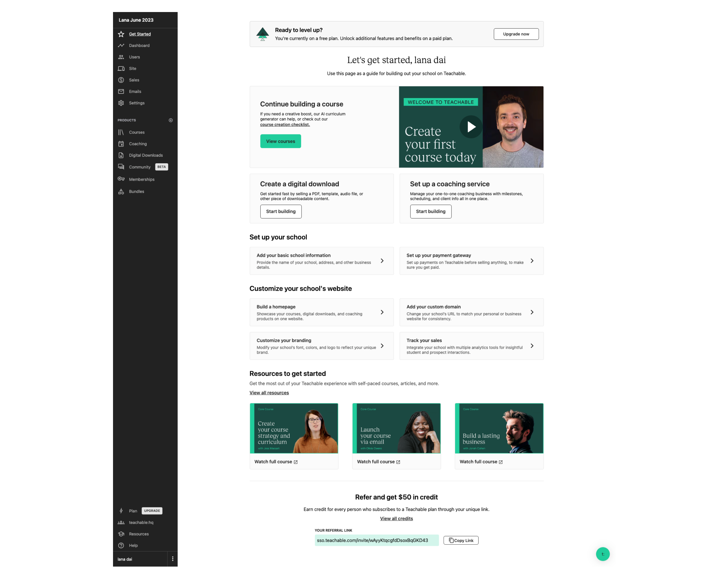
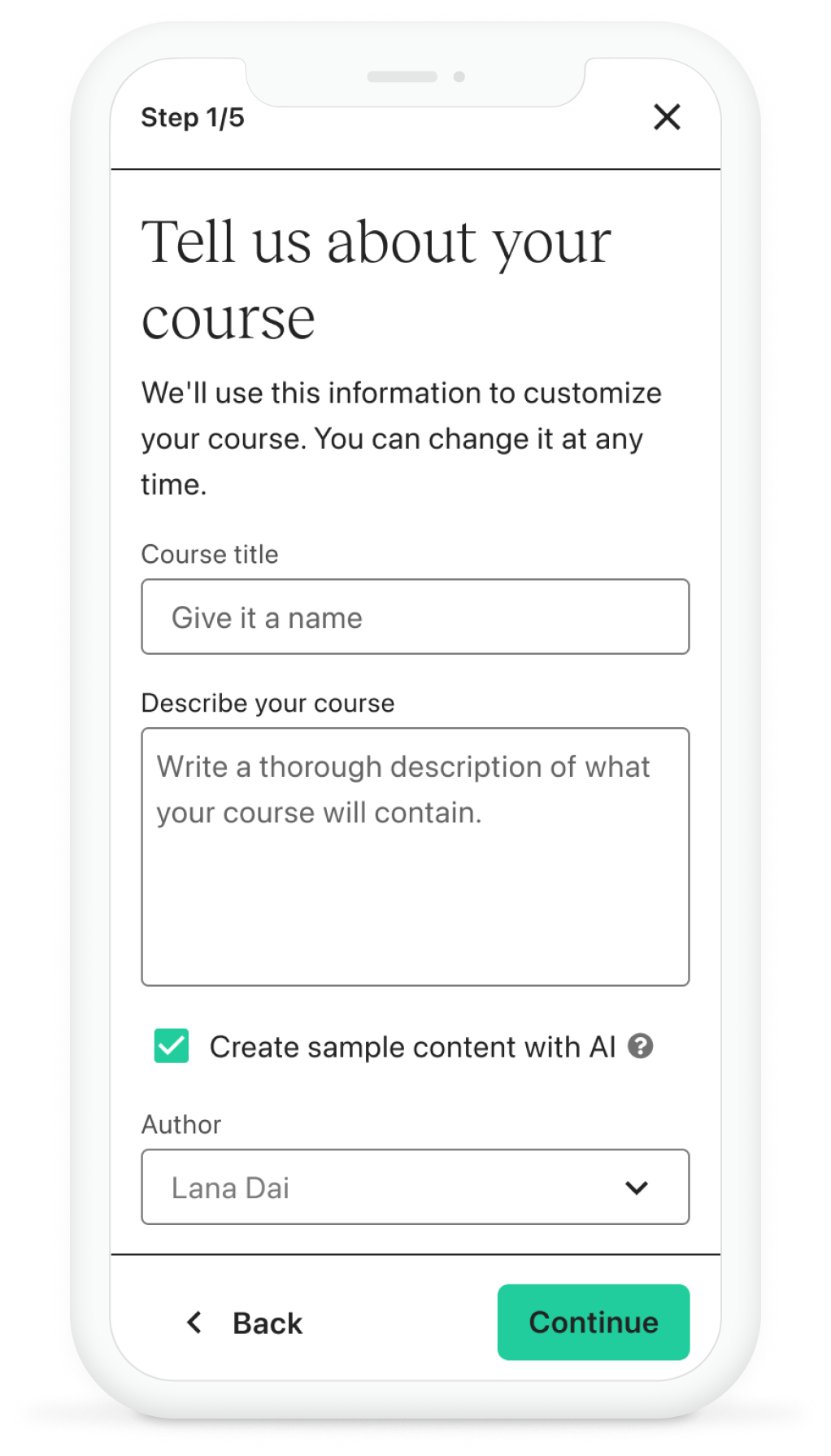
Before the onboarding project kicked off, the “Get Started” screen was the only way to help users get started with the app. Users were dropped on this screen after they’ve signed up for an account and didn’t have a great sense of where to begin. In a later iteration of this experience, the “Get Started” screen was redesigned to focus all new users to create a course since the majority of new users came to Teachable to create a course. However, we did miss out on the opportunity for new users to discover lower lift products such as Digital Downloads here.
The problem with Onboarding
Effective onboarding is critical for schools' success. Many miss the mark by not taking early action, with most failing to create courses in the first month. However, those that act quickly, building content within the first two weeks, significantly increase their chances of converting and succeeding on the platform.
Missed activation potential
More than 75% of new schools don’t create a course in the first month
content drives conversion
Schools that create a course with at least 1 lesson in 15 days convert at a 12x higher rate
Our goal
Improving the onboarding process to help creators reach their activation milestones faster would significantly boost new user engagement.
Research findings
User types
From our research, we found that there were two different groups of users. Those that wanted support and those that wanted to learn on their own.
Do it myself
Another user type we identified wanted to explore on their own. This type of user would navigate around the site to look for features that they were expecting to find.
Seeking support
There was a set of users that needed guidance when onboarding. They expected to be guided through their onboarding experience.
User needs
Even though these two groups were looking for guidance in different ways, they actually share the same goals and fears.
1
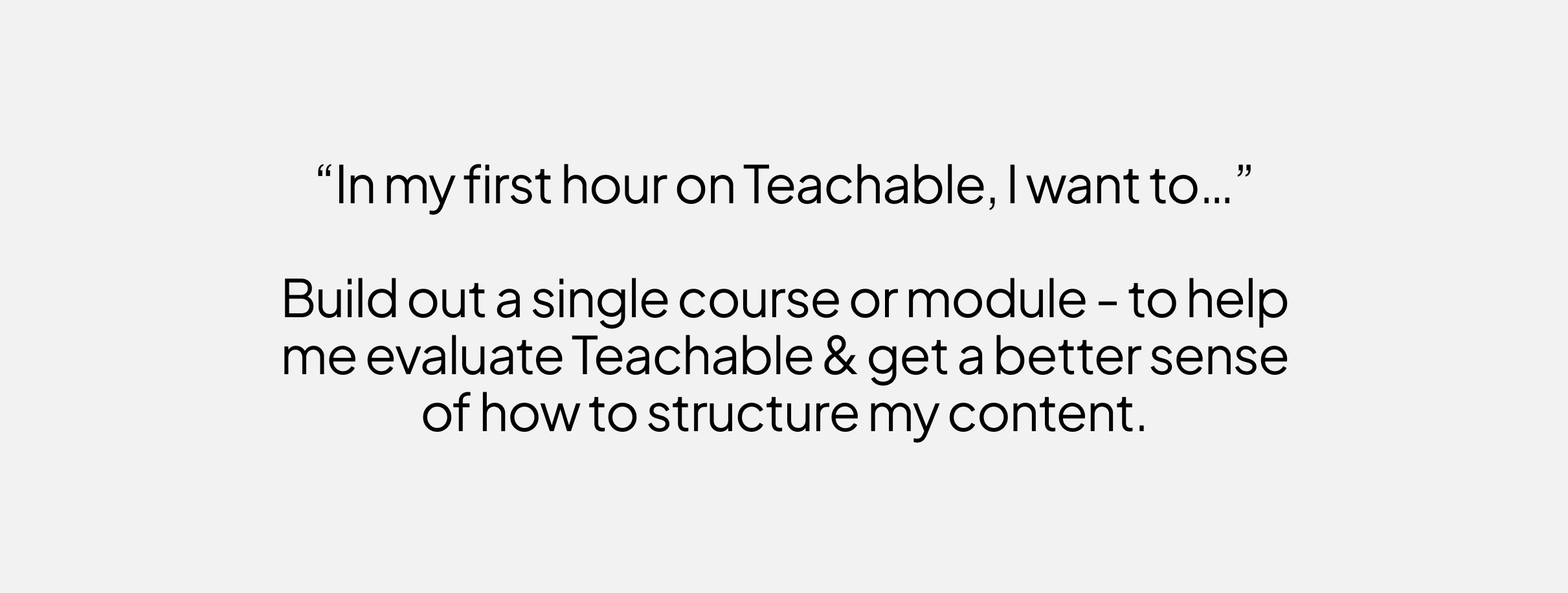
Users want to learn by doing. Their initial questions are about how to use the product, not how to build a business.
2
Previewing the student experience is important, but challenging.
3
New creators fear “doing it wrong” or “missing something” during set-up, and this holds them back from launching.
4
To get started faster, new creators want in-app video tutorials and/or 1:1 consultations with Teachable experts (and they may be willing to pay for the latter).
What’s competition like?
We assessed competitor onboarding experiences to gauge our position. Not all onboarding solutions are universal. Companies must select what aligns with their product and user needs. Extensive features do not always equate to superior outcomes, yet this assessment indicates our current positioning – somewhere in the middle.
Analyzing onboarding user flows
During the review of the onboarding user flows, we found that Teachable takes longer to create products compared to our direct competitors. This delay could impact user experience and competitiveness in the market.
What can we improve from the existing state?
Over Reliance on The Get Started Screen
After completing the sign up survey, users get dropped on the “Get started” screen. Since a course was the primary product, we tried to push users to creating a course. However, this meant that users who came to teachable for Digital downloads, coaching, community were left confused and struggled to find their way to those spaces. In addition, only available for Free and Trial plans landed on this page. If you’re a paying user, there’s no access to “Get started”
Onboarding, before changes
The wrong Focus
Teachable provided very little guided support to new users when they signed up. The guidance offered was centered on school setup rather than product creation. We’ve known from talk to users that they initially struggled with the concept of a 'school'. Their main focus was on creating a course, making the school concept challenging to grasp at first.
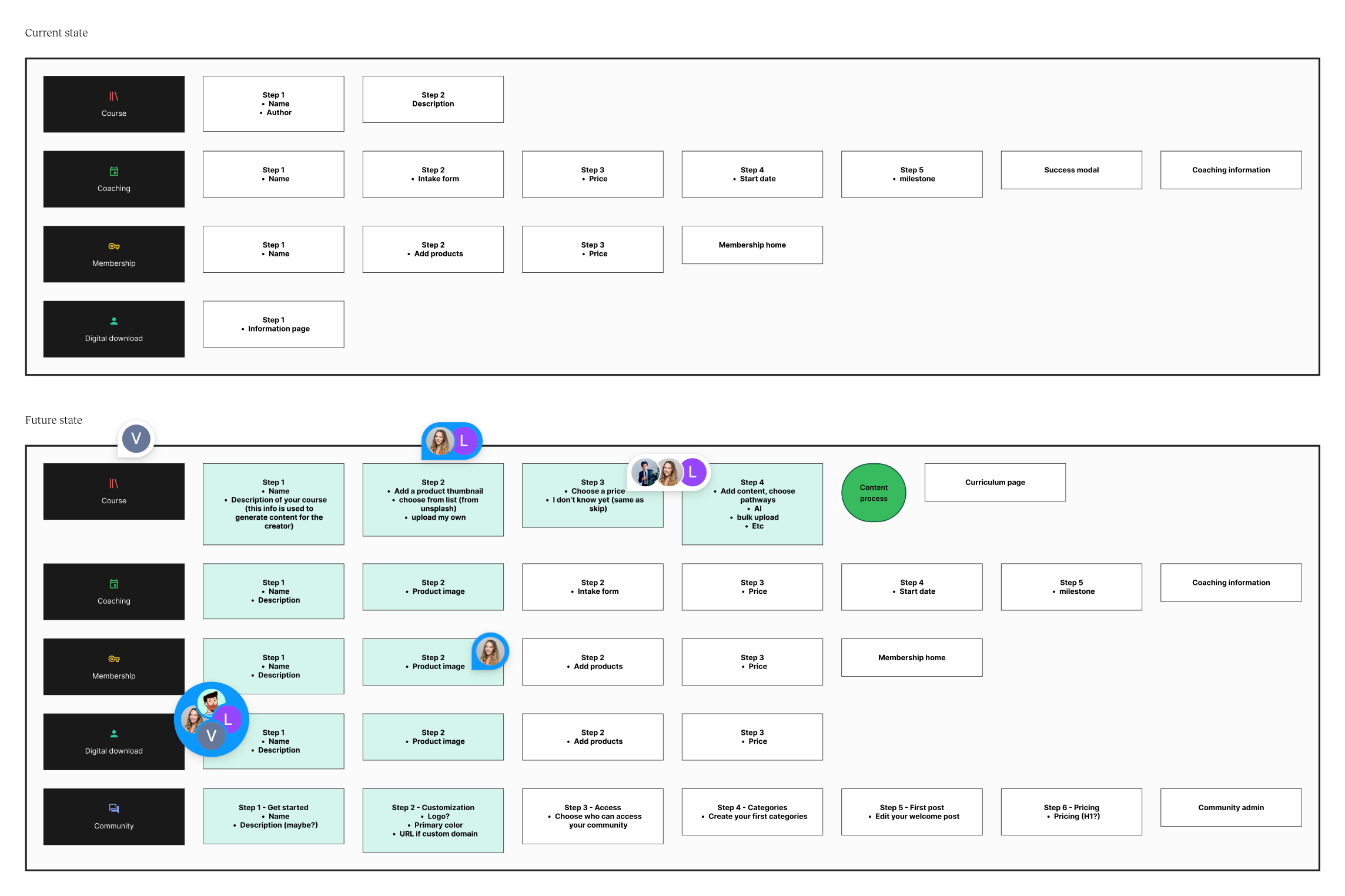
The creation of products lacked consistency
The end of end process from sign up to product publish was fragmented and inconsistent. Product creation differed by type, lacking visual consistency, steps, and information capture.
UX opportunities
Based on what we found in our research, we pinpointed a few challenges that we were looking to address in the future vision
Inconsistency
Product creation differed by type, lacking visual consistency, steps, and information capture.
Lack of guidance
The onboarding experience was not speaking to new users needs. It didn’t indicate progress and left users confused as to how to proceed.
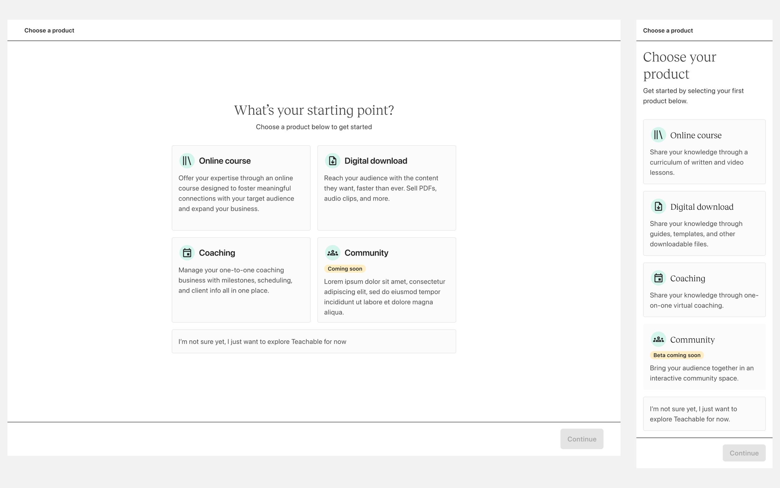
One experience for all
Whether you’re an experienced creator or brand new, the same experience applies. If you intend to create a digital download, coaching sessions or community, you’re first funneled into courses. There is no personalization.
Creating a vision
In order to get the leadership team and the whole organization excited about the new user onboarding process, I teamed up with my PM to paint a picture of what the onboarding experience could be in the future.
A new consistent UI
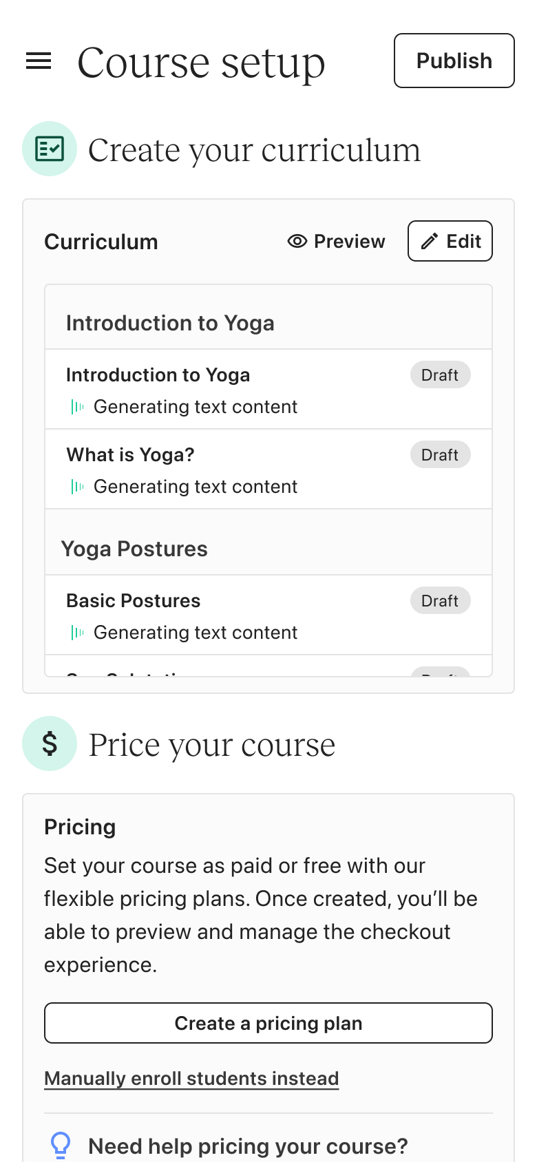
The goal here is to provide a visually consistent UI for setup wizards for all four product types with the same foundational steps.
Personalized guidance
Recommend different task for different users based on survey results to increase the # of new schools creating products, reduce the time to product creation, and increase the % of published courses.
Differentiate user flows
Collaborating with my PM and the Growth team, I mapped out the new onboarding user flow. The goal was to provide a more personalized experience based the product type selected by the new user so that they can accomplish their goal and for us, get to their a-ha moment without friction.
At first glance, it looks like more friction has been added to the onboarding flow. But if you dive deeper, you can see that the experience has been adapted so that we are meeting new users where they are based on what they intend to build first, addressing the needs of users that need guidance while also providing a way for those who don’t need it to escape. In addition, product creation was moved forward so users can easily create a product. More steps is not necessarily a bad thing.
Revamped Navigation
UX & navigation challenges continue to be problematic. This is especially applicable to the “do it myself” group of users who want to explore the platform on their own vs. being guided. Providing an intuitive navigation will help these users find and discover features on their own. Investing in how our users navigate our core product, courses, is necessary for all of the onboarding work we do to be successful.
Approach to the work
Mapping a potential future state
I took a deep dive into how a new user goes through signup to course creation to see how fragmented it is. Based on this, the team figured out what needs to be tackled first. As you can see, one of the first things we did was to remove unnecessary steps in the flow which caused friction to streamline the process.
Planning out the work
Because the onboarding scope was huge and covered a lot, it was important to carefully plan the pod's tasks and make sure to share our plans with all the stakeholders to keep everyone is on the same page. I worked with the PM and EM to visually map and phase out the work for specific onboarding projects based on confidence and technical complexity.
Phase 1
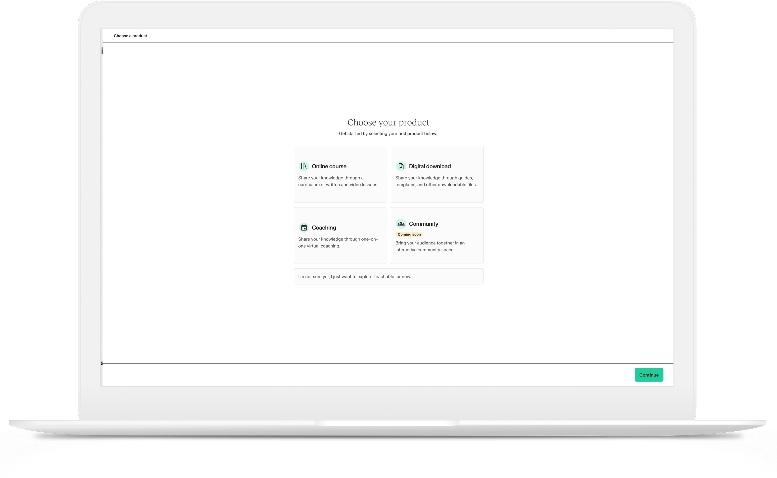
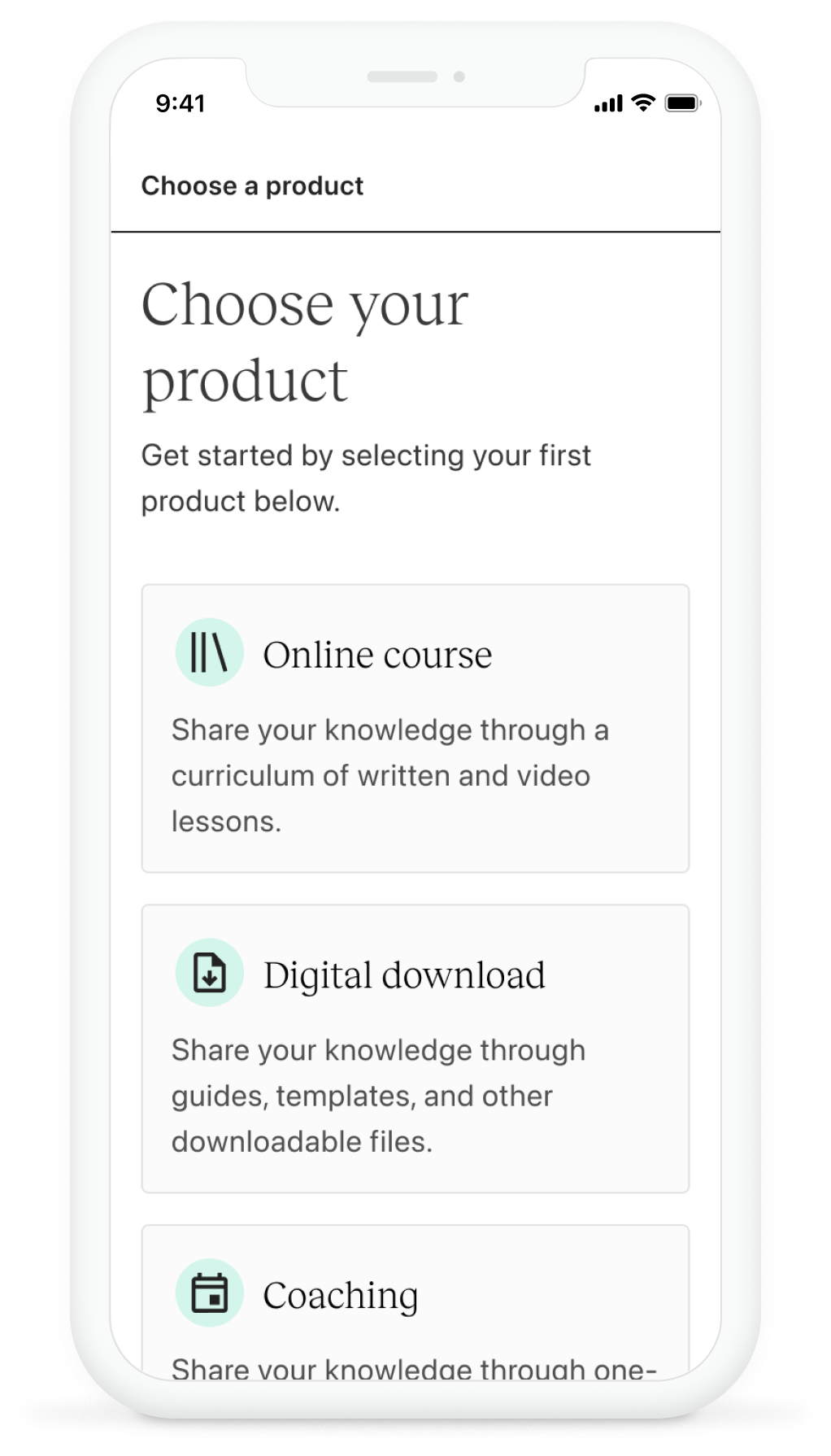
Product selection and Streamlining the flow
In the first phase of the project, we removed the guided onboarding steps (school setup and education) and introduced a bit of personalization. This is where we ask the user what they wanted to build first. They choose a product and we funnel them into the “Get started” screen but now it reflects the product they’ve selected vs. a course.
Phase 2
Consistent UI
When I was working on designing the wizard, one important thing I had to think about was if this design approach could work for all products and other setups like payment experiences. Investing time upfront to create this pattern turned out to be extremely valuable as it really sped up the process of designing and developing the various wizards. Moreover, it helped us keep a uniform onboarding interface and experience across various products.
Consistent Steps and data capture
In the previous design, the product creation process lacked consistency in how data was captured, especially during onboarding. Capturing essential information upfront is key to measuring user intent and progress. A major issue was the absence of onboarding steps for creating a Digital Download. Users would simply click "create" and be dropped into a form to input product details afterward, leading to inaccurate data on how many digital downloads were genuinely intended. In the redesign, I introduced a more consistent onboarding flow across all product types, allowing us to better track and understand user intent.
Concept explorations and user testing
I conducted concept testing with recent new users to determine which concept was more effective. In addition, concepts were shared internally for feedback. Although our users primarily access Teachable via desktop, there is significant mobile traffic that was observed via the sign up process. Based on the testing results, we settled on the wizard approach as it was easier for users to understand and not everyone was fond of the conversational approach.
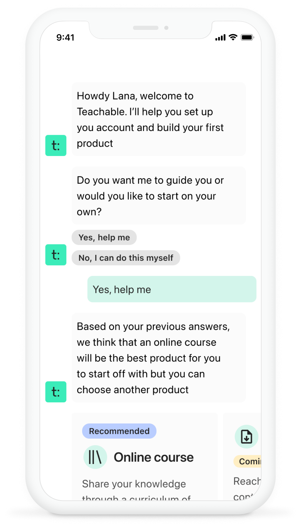
Conversational interface concept
Setup wizard concept
Setup wizard - user testing
In the evaluation of the wizard steps, a notable issue that emerged was the timing of the pricing step. It raised the question of whether users are ready to establish prices at this stage of the process. Findings from moderated usability testing revealed a strong preference among new users for having immediate access to the pricing plan.These users displayed a keen interest in exploring the different pricing alternatives available.
Based on the testing, I also identified some guidelines to follow when designing the experience:
Provide clear explanations of each product's purpose and functionalities.
Detail all available options.
Include illustrative examples, such as a curriculum outline.
Ensure users are aware of their ability to modify options at any time.
user testing results summary
Phase 3
Redefining the “Home” experience
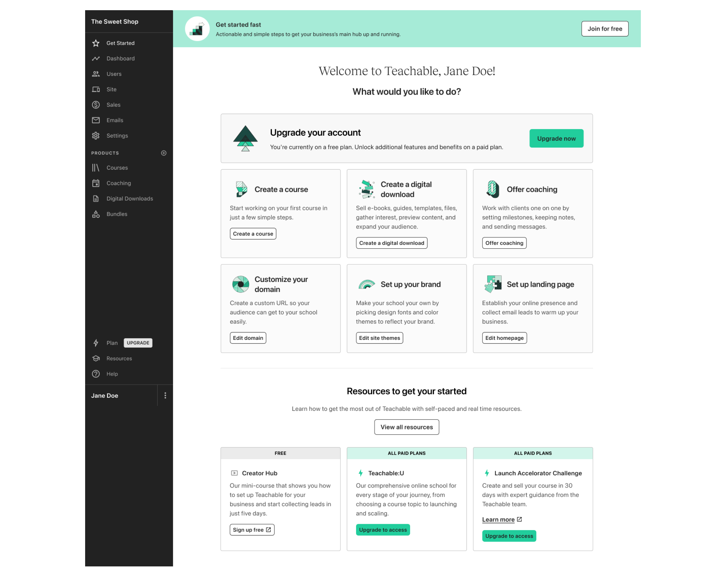
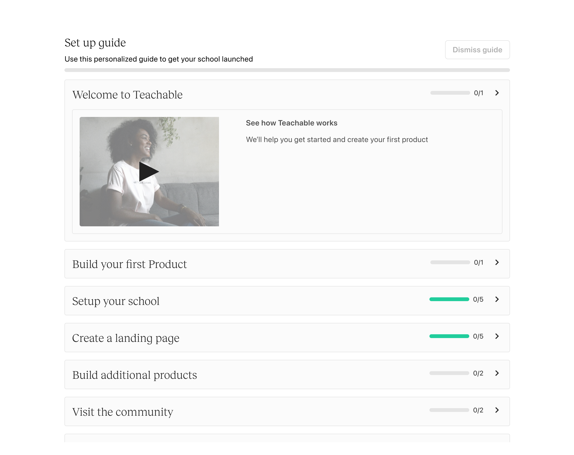
One challenge we encountered was having separate screens for onboarding (“Get Started”) and the Home page (“Dashboard”). This setup caused issues, as the “Dashboard” was the default home screen, showing data like sales and new student information. For new users, this screen was empty, creating a disconnect in the experience. Additionally, having separate screens led to users often missing the “Get Started” onboarding screen altogether. To address this, we unified the “Get Started” screen with the “Dashboard” and renamed it to “Home,” creating a more seamless and intuitive entry point for all users.
Dashboard - old
Home - new
Warning messages Can be complex
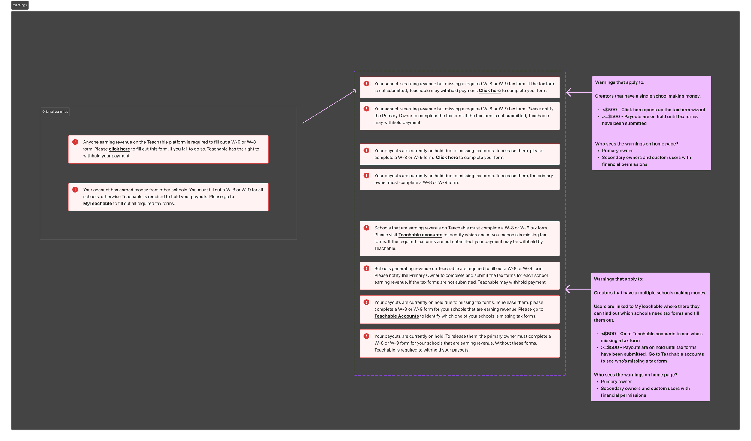
During the home page redesign, one of the more complex challenges we addressed was related to tax form warning messages. These messages are based on a set of intricate rules, depending on the user and their earnings. Previously, there were only two generic warning messages, which didn’t effectively communicate the issue, leading to frequent customer support inquiries. Collaborating with the commerce, finance, and customer support teams, I redesigned the warning system to provide more specific, clear messages tailored to the appropriate user. Although the number of warning messages increased, only one is shown at a time. Now, messages are distinct for primary vs. secondary owners and clearly explain why payouts are on hold, with the goal of reducing confusion and support requests.
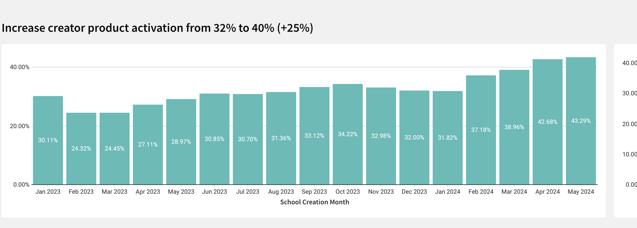
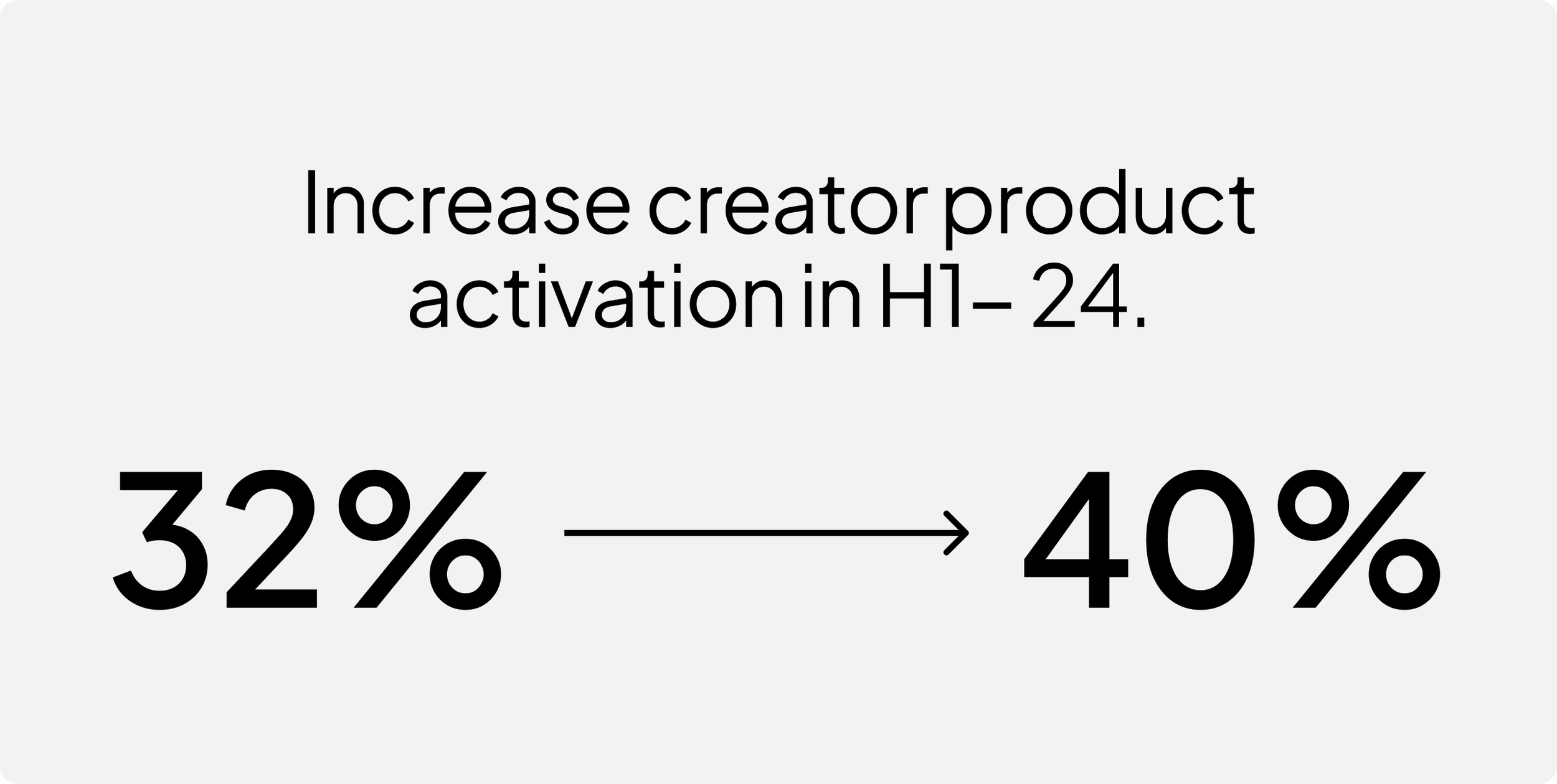
Impact
Product activation increased to 43%
Time to course publish decreased from 24 days to 12 days